MoneyKids
Redesigning a financial learning experience for kids.
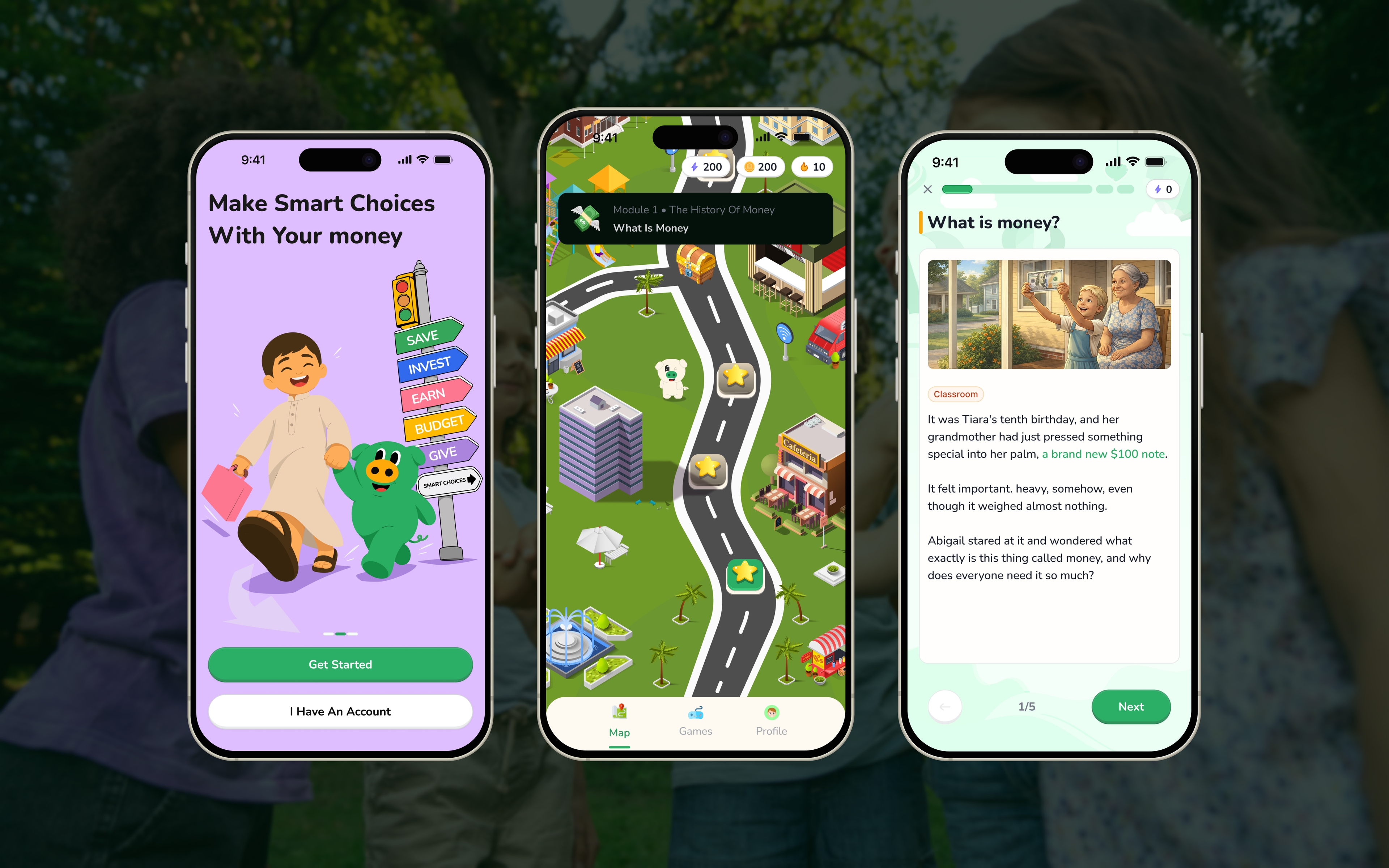
MoneyKids is a financial learning product designed to help children understand money through experiences that feel familiar, interactive, and rewarding. Instead of presenting financial education as something children simply read about, the product uses lessons, scenarios, quizzes, games, progress systems, and social experiences to make learning something they can actively participate in.
I worked across the product experience, from the learning journey and onboarding to gamification, social features, profiles, parent experiences, and the overall visual direction of the redesigned product. The work was not about adding more features for the sake of adding features. It was about making the different parts of MoneyKids feel connected, easier to understand, and more engaging for both sides of the product: the child who is learning and the parent who is responsible for their experience.
MoneyKids is now a live product with 10K+ downloads, giving the redesigned experience a growing audience beyond the design file.
The opportunity
Financial concepts can be difficult for children because many of them are abstract. Saving, spending, earning, budgeting, needs, wants, and making financial decisions are easier to understand when children can connect them to situations they already recognise.
The challenge was therefore bigger than designing attractive screens. The experience needed to introduce financial ideas without overwhelming children, make learning interactive without turning everything into a game, show progress clearly, make rewards meaningful, and give parents enough control without making the child experience feel controlled.
The redesign also had to make social features feel fun while keeping appropriate parental oversight, and make all of these individual features feel like one product. That became an opportunity to rethink MoneyKids as a connected learning system rather than a collection of individual screens.
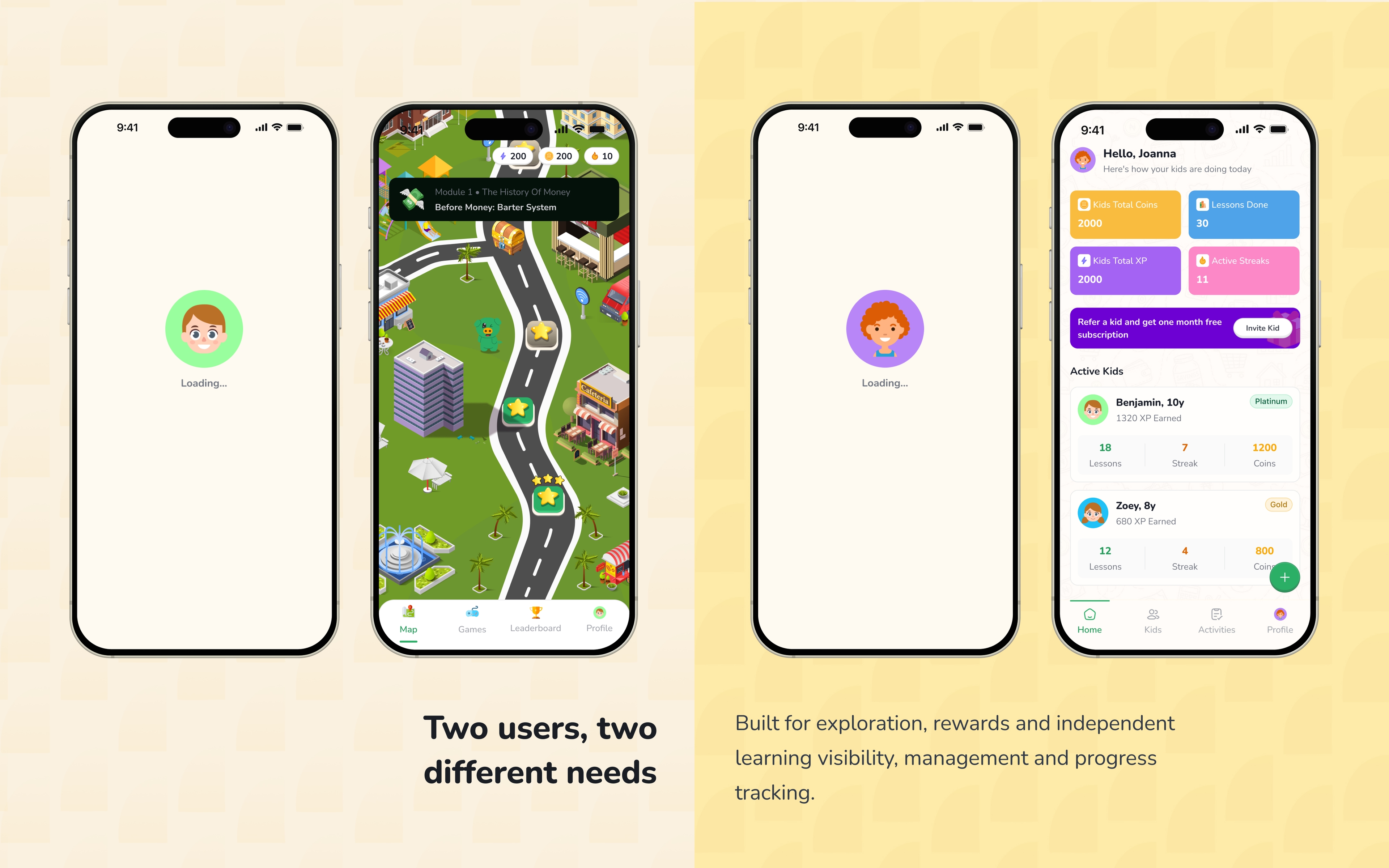
Designing for two different users
One of the biggest shifts in the product was recognising that MoneyKids serves two very different audiences. The child needs room to explore and interact with the product without feeling like they are using a school portal, while the parent needs enough visibility and control to understand what is happening and step in where necessary.
Exploration
Children should be able to discover and interact with the product in a way that feels inviting rather than instructional.
Motivation
Progress, rewards, streaks, achievements, and friendly competition help make learning feel continuous and worth returning to.
Simplicity
Financial concepts need to be broken down into language and interactions that children can understand.
Visibility
Parents need to understand what their child is doing and how they are progressing.
Control
Certain actions, particularly around social interaction and account management, need parental involvement.
Clarity
Subscriptions, children management, profiles, and settings should feel straightforward.
This meant the product could not simply have one experience adapted for everyone. It needed to give children their own space while giving parents the control and visibility they need.
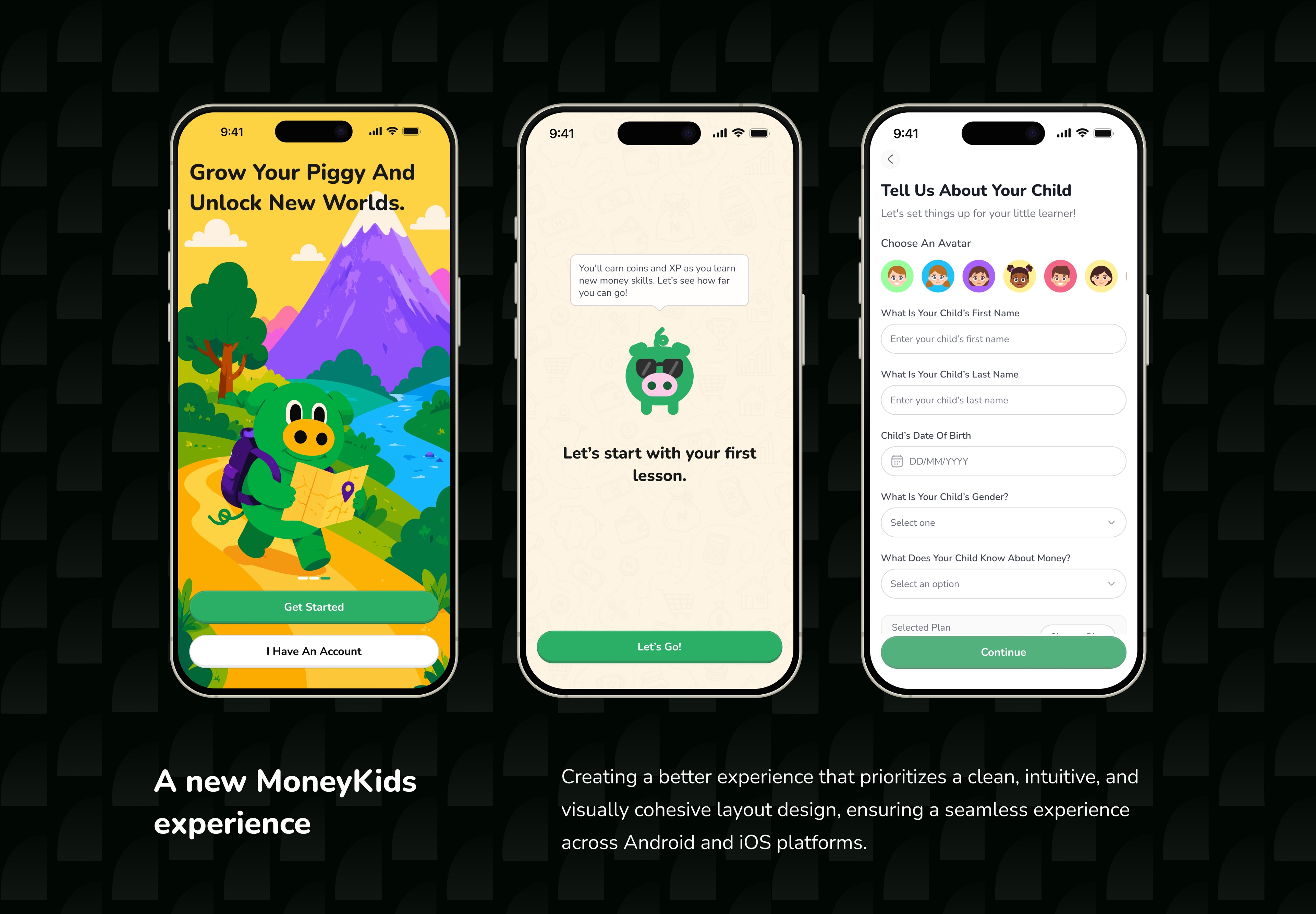
Experience before commitment
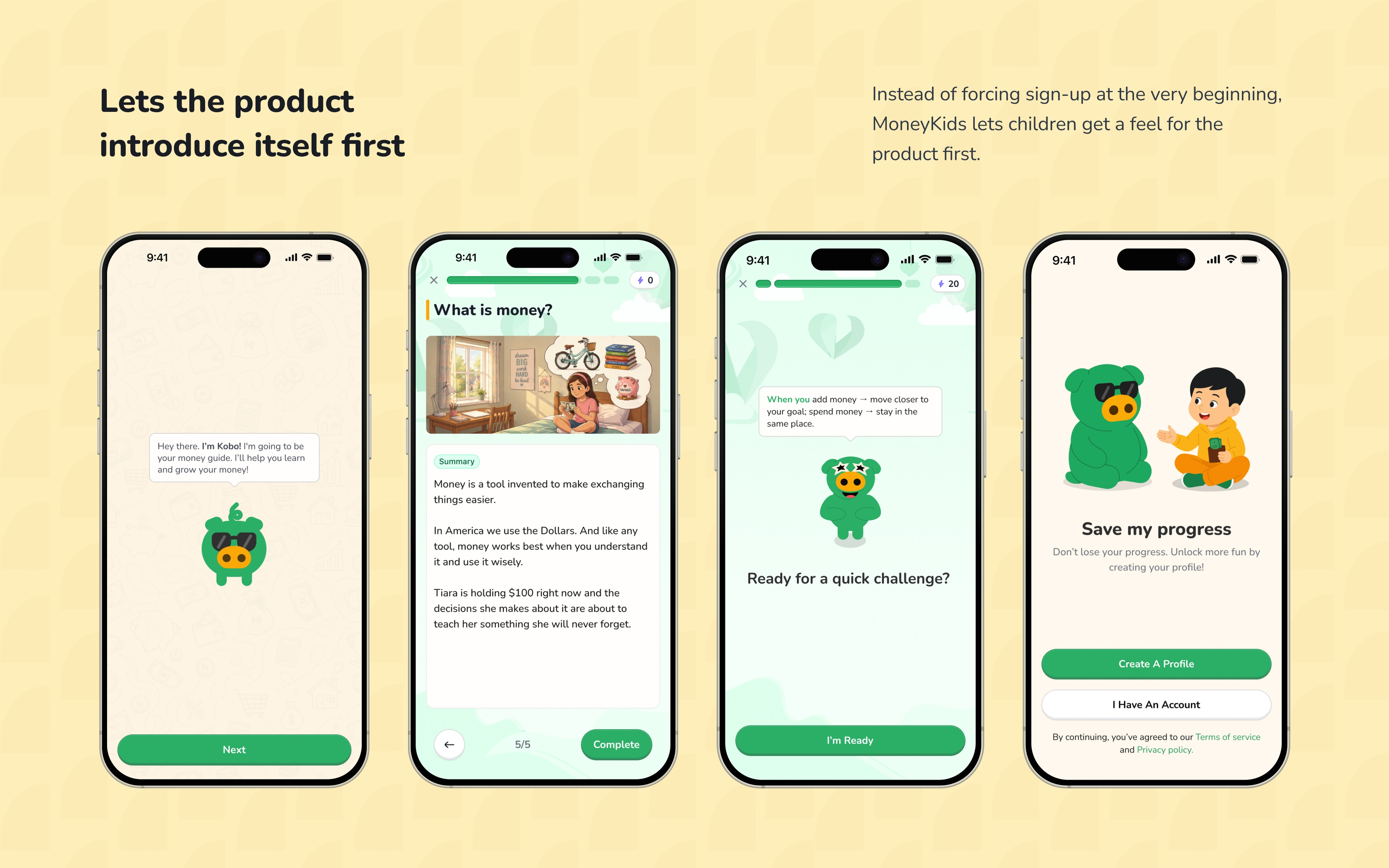
One of the key design decisions happened before the child even started learning. Previously, the experience pushed users towards authentication early, so the redesign let children experience the product before being pushed into sign-up.
A child can begin interacting with the learning experience, explore lessons, scenarios, quizzes, and other parts of the product before being forced into an immediate commitment. The idea was simple: let the product demonstrate its value before asking the user to commit to it.
This reduces the feeling of friction at the beginning of the journey and gives MoneyKids an opportunity to communicate what the experience actually feels like. Sign-up and subscription can then appear when they make more sense within the journey.
From learning content to a journey
Learning in MoneyKids is structured as a journey rather than a list of disconnected topics. The map gives children a sense that there is somewhere to go and something to work towards.
Lessons introduce concepts, scenarios give those concepts context, quizzes let children test what they understood, and the progress system makes that movement visible. The map therefore became more than navigation; it became part of the motivation system.
A child should be able to look at the journey and understand where they are, what they have completed, what they can do next, and what they are working towards.
Making financial learning easier to enter
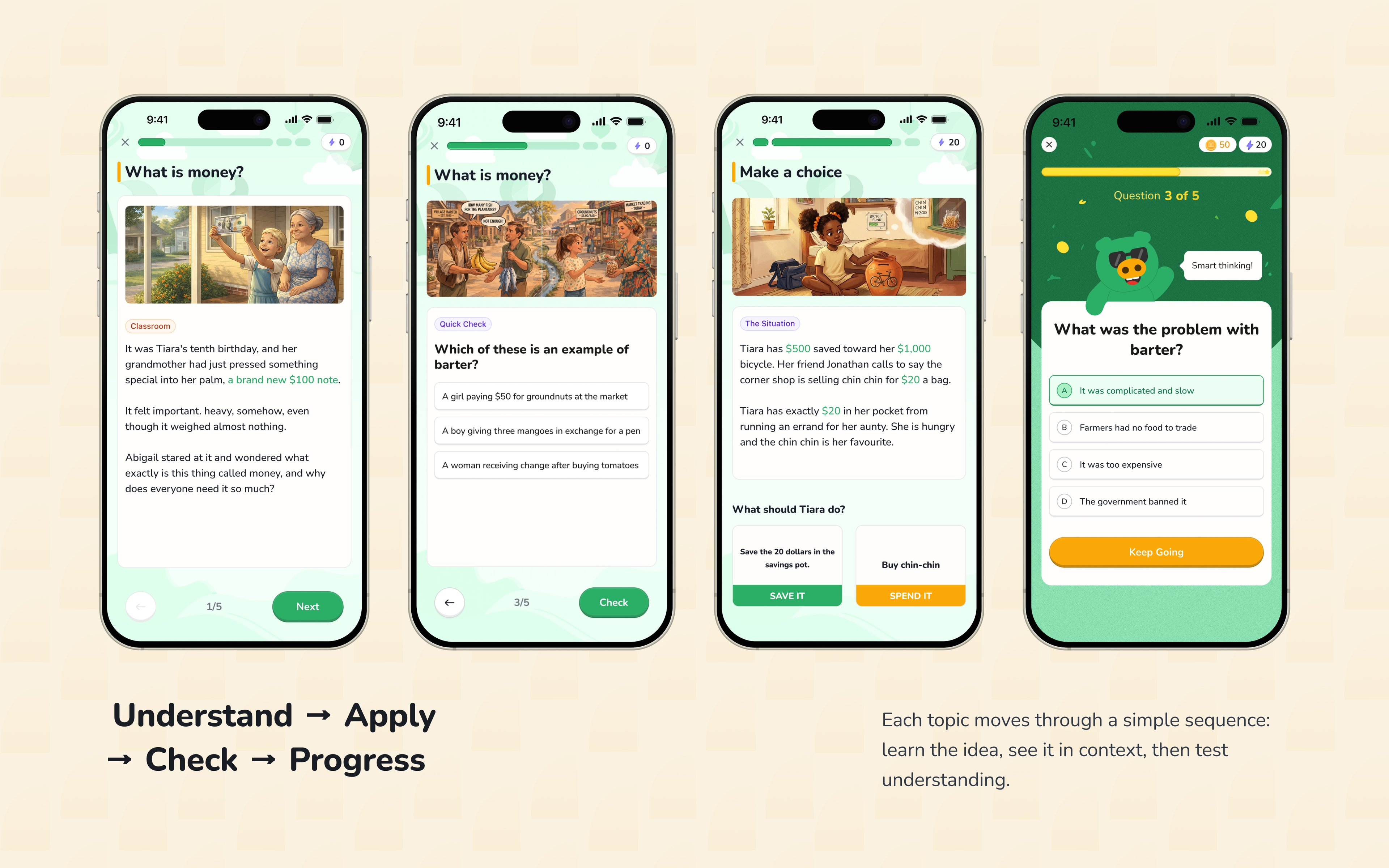
The learning experience is built around three connected moments that move a child from understanding a concept to applying it and checking what they learned.
Lesson
The lesson introduces the financial concept in a simple and approachable way.
Scenario
The scenario moves the concept into a situation a child can recognise, so the child thinks about what they would do rather than only what a term means.
Quiz
The quiz checks whether the child understood the idea and gives them an immediate sense of progress.
Together, these moments create a small learning loop: Understand → Apply → Check → Progress. The sequence helped move the experience away from simply presenting information and towards active participation.
Designing motivation into the experience
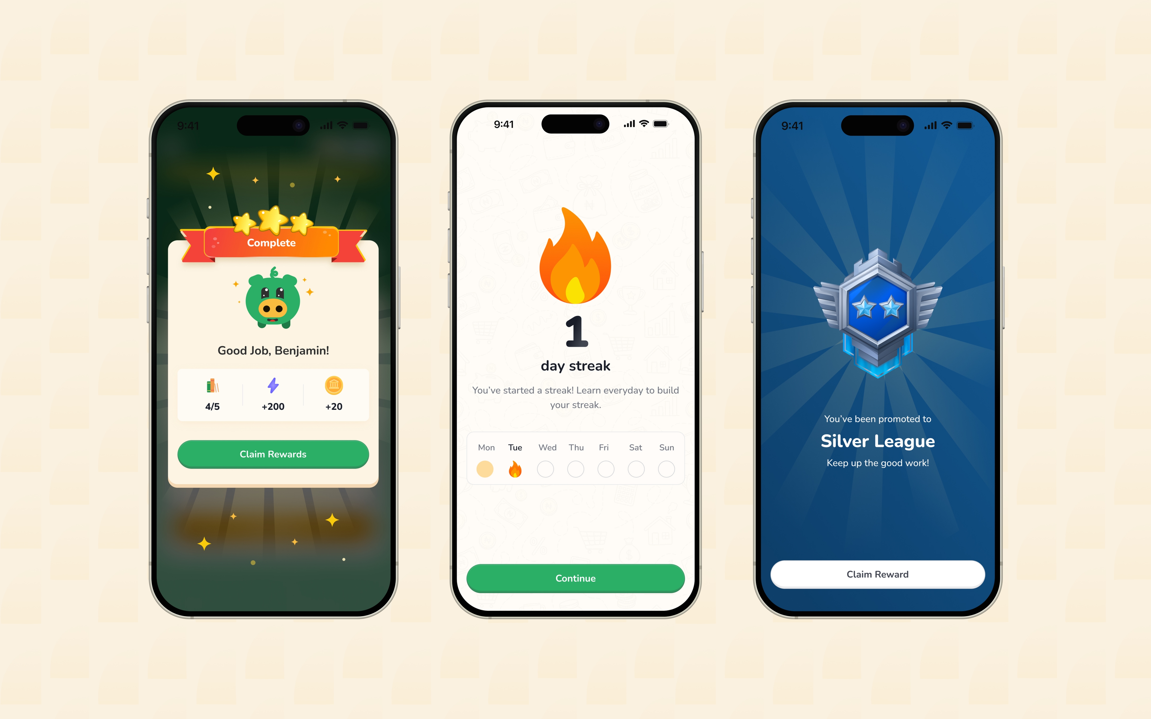
Gamification was not treated as decoration. XP, coins, streaks, achievements, badges, and rewards each give the child a different reason to continue and a different way to understand progress.
XP communicates progress, coins create a reward currency, streaks encourage consistency, achievements recognise milestones, and badges give children something to collect and identify with.
The important part was making these systems feel connected to learning rather than making the product feel like a game with financial content added to it. A child should understand that something happened because they completed a lesson, answered questions, maintained a streak, or reached a milestone. That small sense of cause and effect makes progress more meaningful.
MAKE PROGRESS VISIBLE.
Competition without losing the learning
The leaderboard introduces another layer of motivation. Children can progress through leagues, see how they are performing during the week, and work towards promotion.
The system gives progression a visual reward through badges, trophies, and reward chests, but the important part was making the leaderboard feel like part of the MoneyKids world rather than copying another product's visual language.
Promotion gives children something to work towards, demotion creates stakes, weekly summaries give the experience a sense of rhythm, and rewards make the end of the week feel meaningful. Together, those pieces make competition supportive of the learning journey rather than a distraction from it.
Learning beyond the main lesson path
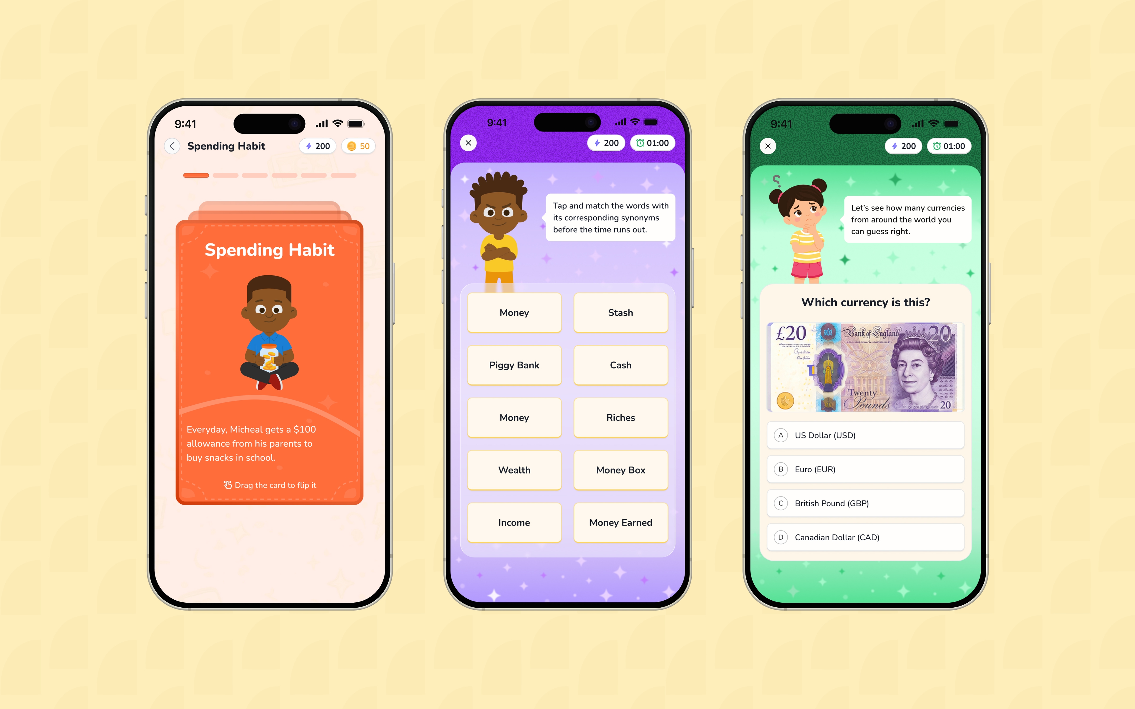
Not every child will want to learn in exactly the same way, so MoneyKids also introduces other learning experiences beyond the main lesson path, including games and flashcards. These experiences give children more ways to practise financial concepts without replacing the core learning journey.
Flashcards
The flashcard experience was designed to feel more active than simply swiping through information. A card can introduce a short story or situation, reveal a question, and let the child make a decision. The interaction creates a rhythm of Read → Think → Answer → Reveal → Continue, with the card itself becoming the main interaction rather than a flat question-and-answer screen.
Guess the Currency
Guess the Currency helps children recognise currencies from around the world. A currency is shown on the screen and the child selects the correct answer, turning recognition into a quick, repeatable challenge.
Tap and Match
Tap and Match asks children to connect money-related words with their corresponding synonyms. The interaction keeps the activity simple and tactile while helping reinforce financial vocabulary.
Giving children their own identity
The profile becomes more than a place to store information. It gives children a visible identity in the product. The profile also gives children a place to see what they have accomplished. The badge and achievement systems make the profile feel personal rather than purely numerical.
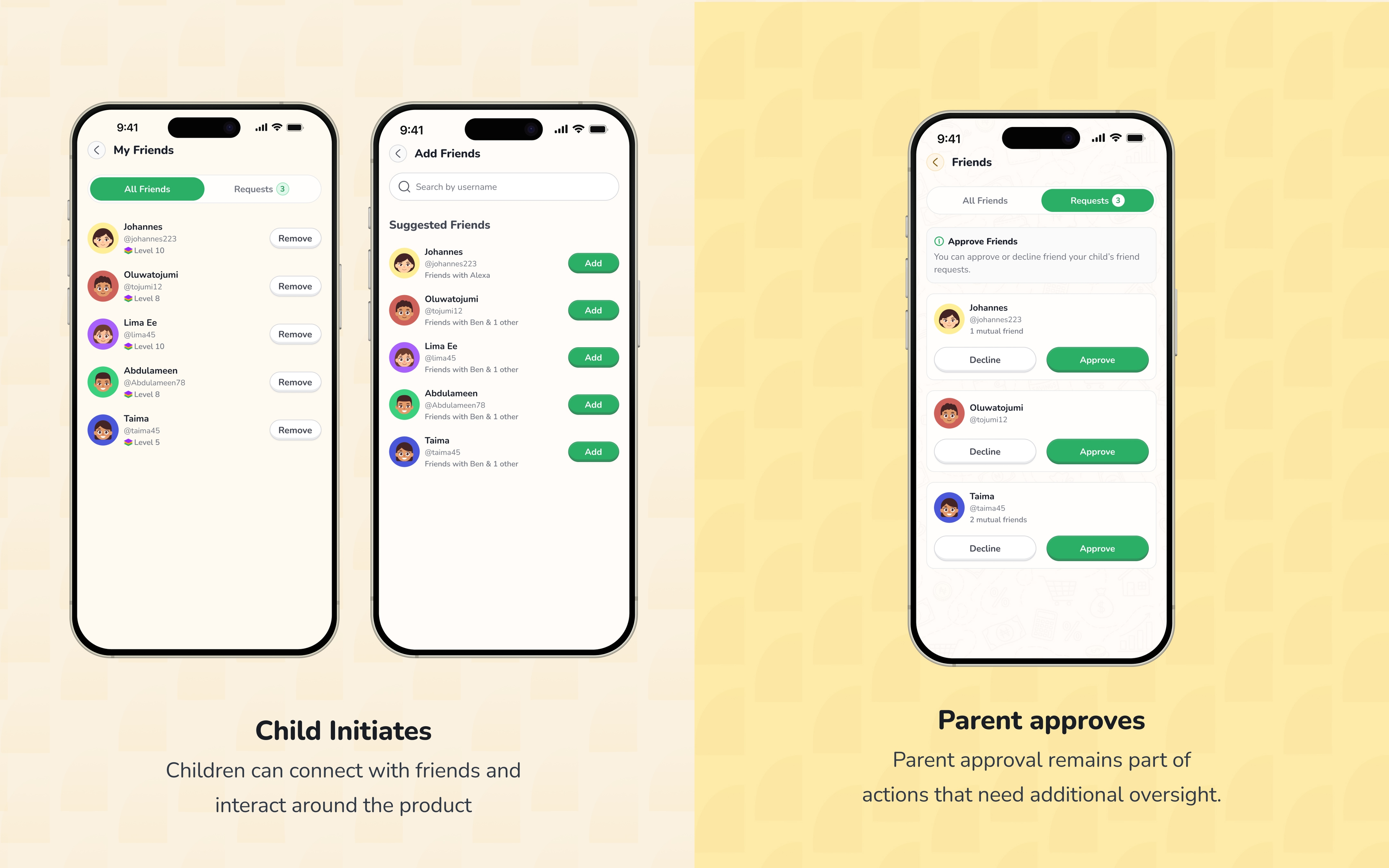
Friends, with parents still in the loop
The social experience introduced another important design consideration. Children can add friends using usernames or suggestions, but friend relationships are not completely autonomous because parents remain involved in friend requests.
Parents can approve or decline requests, giving children the opportunity to have a social experience while keeping an important layer of parental oversight.
There are also moments where children can ask friends for coins or XP. A child may receive a request such as “Alex needs 50 coins from you,” and decide whether to send them. The interaction is intentionally simple, while the parental controls help keep the social layer appropriate for the product.
Building the parent experience separately
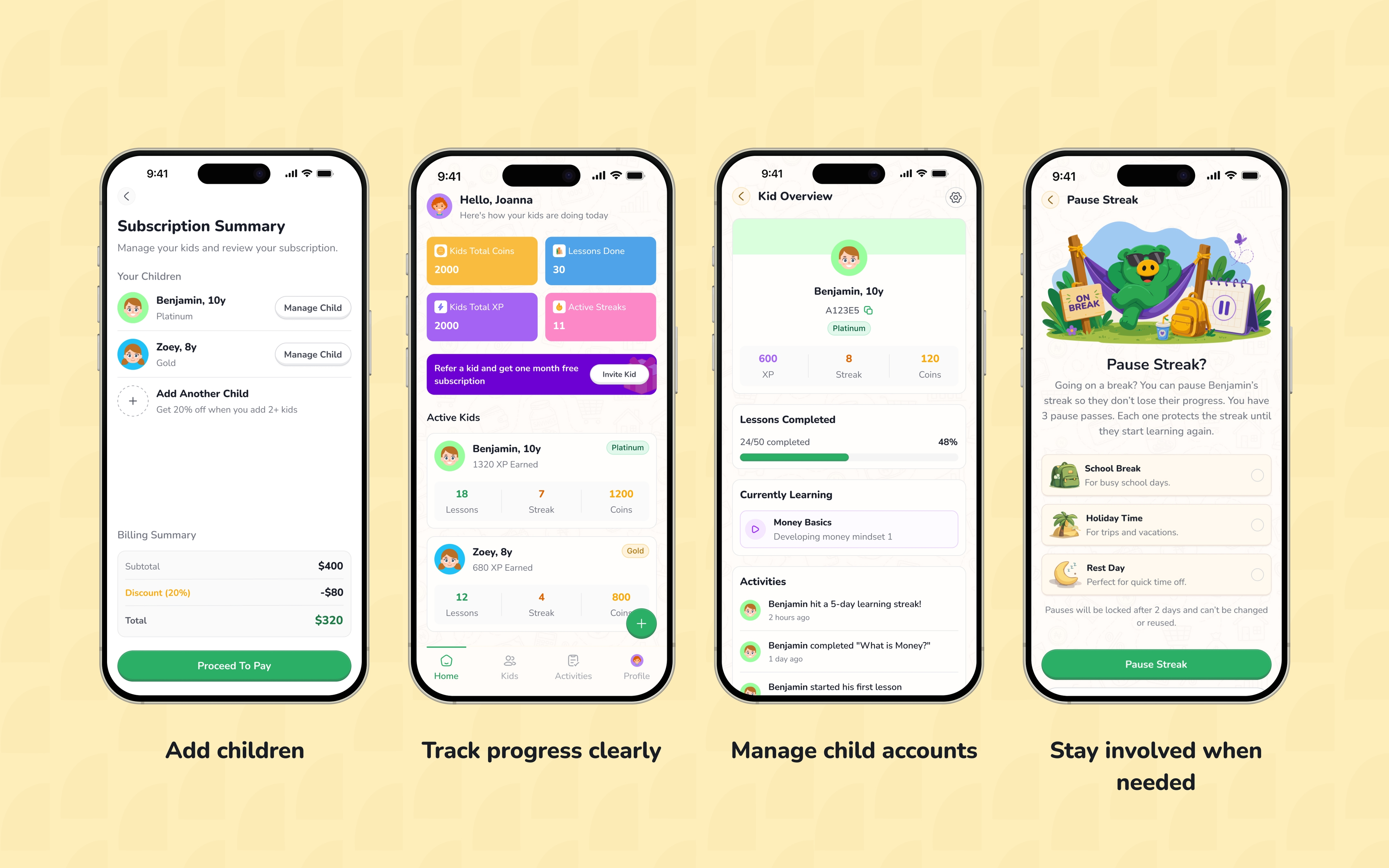
The parent experience also changed significantly. Instead of treating the parent as another layer inside the child's profile, the redesign gives parents their own profile and their own experience.
The parent dashboard provides a clearer place to manage children, understand progress, and handle account-related actions. Adding children was also simplified so that the information parents need to provide can be handled without unnecessary friction.
After payment or account setup, parents can understand their children at a glance and move into the appropriate child experience. The product therefore has two connected experiences rather than one experience trying to serve everyone at once.
A visual language built for children
The visual direction needed to feel playful without becoming noisy. MoneyKids uses a warm, approachable visual language with rounded forms, friendly illustrations, bold colour, soft visual depth, and expressive details.
Designing for children also reinforced that children do not need everything to be colourful; they need things to be understandable. Clear feedback, strong hierarchy, obvious interaction states, and understandable cause and effect matter more than decoration.
The colours, characters, illustrations, cards, patterns, badges, and rewards work best when they support comprehension first and excitement second.
“Designing for children isn't just about making things colourful and fun. It's about understanding how they see, understand, explore, and respond to an interface.”
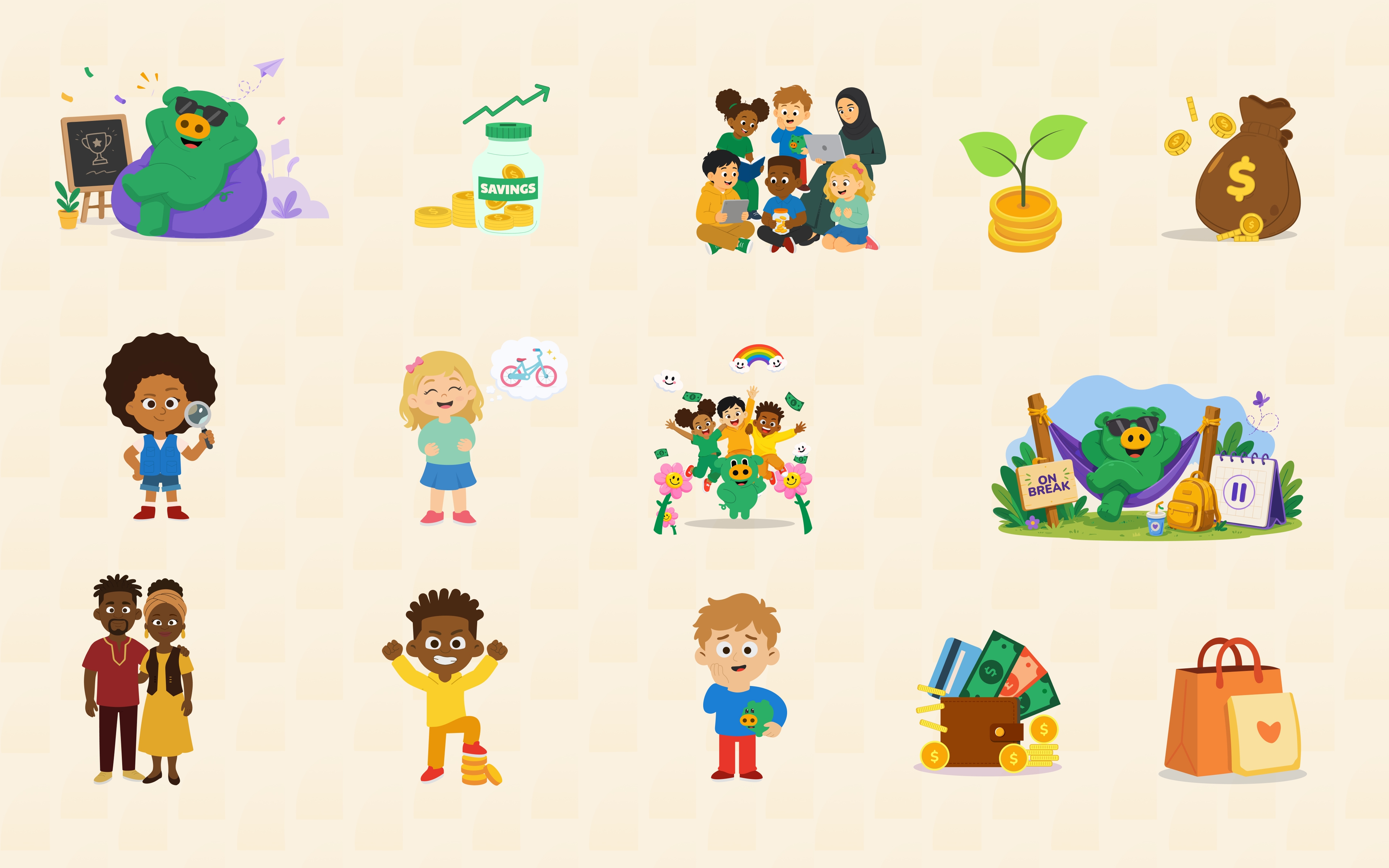
Illustration as part of the product experience
Illustration became an important part of making the product feel approachable. Kobo, the MoneyKids mascot, helps give the learning experience a recognisable character and a friendlier point of entry.
Characters and visual moments help make abstract financial ideas easier to enter. Rather than relying on illustration as decoration around the interface, it can support storytelling, introduce situations, celebrate progress, and give different parts of the product their own personality.
My contribution to the visual direction also extended into selected illustration and visual assets used across the experience. The goal was to create a world that children could recognise as their own without making the product feel childish or overly cartoonish.
Designing a connected system
One of the biggest lessons from working on MoneyKids was that individual screens are only part of the job. A beautiful lesson screen does not solve much if the journey into that lesson is confusing, and a good reward screen does not mean much if the child cannot understand why they received the reward.
The same applies across the rest of the product. A leaderboard is less useful if progression, XP, badges, and rewards are disconnected, and a parent dashboard does not solve the problem if the parent and child experiences still feel like the same account.
The redesign required thinking across the entire product: Onboarding → Learning → Progress → Rewards → Social → Parent. Each part needed to make sense on its own while still contributing to the larger experience.
Working on a live product
MoneyKids is not a speculative concept. It is a live product, which changed the way I approached the work because design decisions had to exist within an actual product, existing requirements, engineering considerations, and an evolving visual system.
The work was not simply Design → Present → Done. It involved thinking about how new ideas fit into what already existed, how different features affected one another, and how the experience could evolve without losing its identity.
That constraint made the work more interesting and pushed me to think less about isolated screens and more about the product as something people would actually use.
What changed
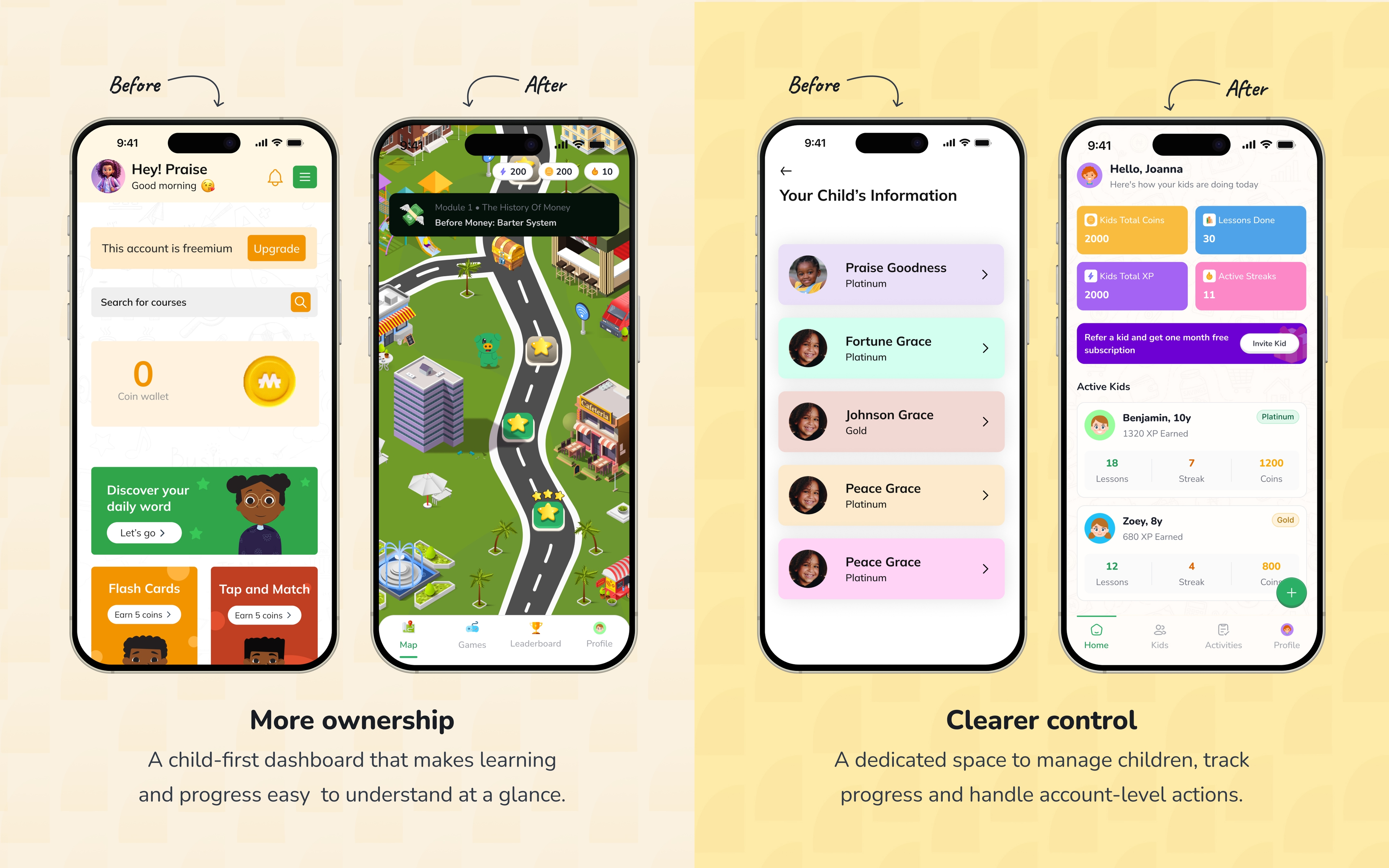
The redesign brought several parts of the MoneyKids experience into a clearer relationship. The child gets a more independent learning experience, while the parent gets a more purposeful space of their own.
Learning has a clearer structure, progress is more visible, gamification supports the learning journey instead of sitting beside it, social features include parental oversight, and additional learning formats create more ways to engage.
The visual system also gives the product a more cohesive personality. The most important change, however, was not a single screen; it was the shift towards thinking about MoneyKids as a complete learning experience.
What I learned
01. Designing for children is not the same as designing something colourful
This project changed how I think about children's products. Children are not simply adults who need brighter colours and bigger buttons; they interpret information differently, have different attention patterns, and need interfaces that make cause and effect obvious. Fun is important, but clarity is what allows the fun to work.
02. Gamification needs a reason
XP, coins, streaks, badges, and leaderboards can easily become decoration. They become useful when each one reinforces a behaviour or helps the child understand their progress. The question is not “What reward can we add?” but “What behaviour are we helping the child understand or repeat?”
03. Designing for children also means designing for their parents
A child may be the person using the product, but the parent is still part of the experience. That became particularly important around accounts, subscriptions, children management, and social interactions. Good children's products need to create independence without removing the appropriate adult oversight.
04. A product redesign is rarely just a UI exercise
The more I worked on MoneyKids, the more the boundaries between UX, product thinking, visual design, and strategy disappeared. Changing onboarding affected activation, profiles affected social interaction, progression affected rewards, and the parent experience affected account structure. The decisions were connected.
05. Live products teach you to design differently
Working within a live product means there are already users, expectations, technical realities, and existing decisions. You are not designing on an empty canvas; you are improving something that already has a life. That constraint taught me to be more intentional about what needed to change and what did not.
“This project made me think less about designing screens for children and more about designing an experience children can actually understand, enjoy, and grow with.”
What the design changed.
The redesign connected learning, motivation and parent oversight into one clearer live product experience.
Downloads
MoneyKids has passed 10K+ downloads, giving the redesigned product a growing live audience.
Designed for children and parents
The child experience prioritises exploration and motivation, while the parent experience focuses on visibility and control.
A clearer learning rhythm
Lessons, scenarios and quizzes work as a connected learning loop instead of separate content types.
One visual language
Kobo, illustration, colour and interaction patterns give the product personality while keeping the system coherent.
Shipped product
MoneyKids is available on the web, App Store and Google Play.