Vybecash
One app, multiple wallets and a simpler way to manage everyday money.
Vybecash is a mobile financial product designed to bring multiple wallet accounts and everyday financial needs into one place. Through partnerships with Nigerian banks, the product brings together transfers, bill payments, savings and money management for both individuals and businesses.
I worked as Product Design Lead on the mobile experience, collaborating with the product team and other stakeholders across the redesign. The work covered the customer-facing product as well as the decisions needed to make different financial journeys feel connected rather than fragmented.
The story follows the problems behind the product, the people it was designed for and the design decisions I made while helping rebuild the experience after its first launch.
The redesign moved beyond interface polish into product recovery, helping the rebuilt beta return with measurable users, transaction activity and a broader financial experience.
Managing money should not mean managing a collection of apps.
People often use different bank accounts and financial applications for personal spending, investments and business transactions. That makes it harder to understand everyday activity at a glance, especially when money is moving across different services.
The original research also highlighted practical friction around service downtime, repeated sign-up across multiple apps and dependence on physical payment tools such as POS terminals and cards. For an individual, that creates more steps around routine transactions. For a small business, it can make end-of-day reconciliation harder when different outlets and bank accounts are involved.
The design problem was therefore broader than making transfers easier. Vybecash needed to create a clearer picture of a user's financial activity while also giving them more ways to complete transactions when one route was unavailable.
The challenge was not simply moving money faster. It was reducing the number of places people had to check, the number of tools they depended on and the uncertainty that came with fragmented financial activity.
Different financial lives, overlapping needs.
Research was translated into three personas that represented different ways the product might fit into everyday financial life.
Katie Peters · Consultant, 32
A demanding schedule makes it difficult to keep up with utility bills, recurring expenses and personal finances. Katie wants flexible recurring payments, a way to budget and room to invest part of her income.
Opeyemi Audu · Undergraduate, 23
Opeyemi struggles with spending and wants to build a savings habit, prepare for rent and set money aside for unexpected expenses while earning interest.
Koko Enterprise · Footwear manufacturer
With ten outlets in a Lagos market and different bank accounts, the business needs to review daily transactions, budget its operations and keep alternative payment options available during bank downtime.
Together, the personas kept the product from being designed around one narrow idea of a banking customer. The same ecosystem needed to support a busy professional, someone building stronger money habits and a business handling activity across multiple locations.
Build a financial ecosystem that fits into everyday life.
I framed Vybecash as a lifestyle-oriented financial product rather than a collection of isolated banking features. That meant bringing everyday financial needs into one experience that could feel approachable, easy to navigate and useful to both individuals and businesses.
The original market analysis pointed to payments, mobile and digital banking, savings and merchant banking as areas of opportunity. Those figures were projections rather than measured Vybecash outcomes, but they helped frame a wider product direction around multiple wallets, payments, money management and savings.
That direction also created room for financial information and education inside the experience, so the product could support people not only when they wanted to transact, but also when they wanted to understand and plan their money.
Instead of asking users to build a financial routine across several disconnected products, the opportunity was to make more of that routine visible and manageable in one place.
Six questions shaped the design direction.
One place to move, understand and set aside money.
The proposed experience connects multiple wallet accounts with transfers, bills, savings and spending analysis so users can manage more of their financial activity without jumping between separate products.
Users can choose from different savings approaches, including Vault, Wishlist, Tribe and the budgeting feature later described as Stash. The aim was to give different saving behaviours a place in the product rather than treating saving as one generic action.
The product also introduces QR codes and shareable payment links as alternatives to conventional transfers. That gives both individuals and businesses more flexibility around sending and collecting money.
The product direction connected money movement with money understanding: transact when needed, then still be able to see, organise and plan what happens next.
The first launch changed the direction of the design.
Vybecash launched in 2023 and reached more than 1,000 users before the product was paused in October. Feedback from that first release created an opportunity to revisit the customer experience alongside work happening on the back office and underlying product systems.
I treated the next version as more than a visual refresh. I used feedback from the first launch to revisit the core experience, test prototypes with users and question assumptions behind both existing and proposed features.
By January 2024, the customer experience and back office had been deployed again for a controlled beta while remaining technical gaps were being resolved.
The redesign was a response to what happened after launch. Feedback changed the interface, but it also changed how I approached stability, supporting systems and the assumptions behind new features.
Make the first encounter feel like the product's audience.
I revisited onboarding after looking at how people experienced the first version. Because it was the first point of contact with Vybecash, I wanted the revised direction to explain the product clearly while feeling closer to the people it was designed for.
The core audience included students and younger adults trying to manage spending and savings, as well as small-business owners thinking about transaction inflows. I moved the interface toward imagery and messaging that felt more familiar and flexible rather than purely transactional.
Photography helped communicate the product's everyday character, while the entry experience still kept the practical choices clear: create an account or sign in.
Turn the home screen into a useful financial overview.
The earlier home experience centred on four quick actions: fund, transfer, airtime and bills. Users could also view wallet details, transaction activity and beneficiaries, while the bottom navigation linked to savings, history, profile and support.
I reorganised the home around a clearer financial overview. Instead of treating it only as a launcher for transactions, I brought balances, wallets, quick actions, spending context and recent activity into one starting point.
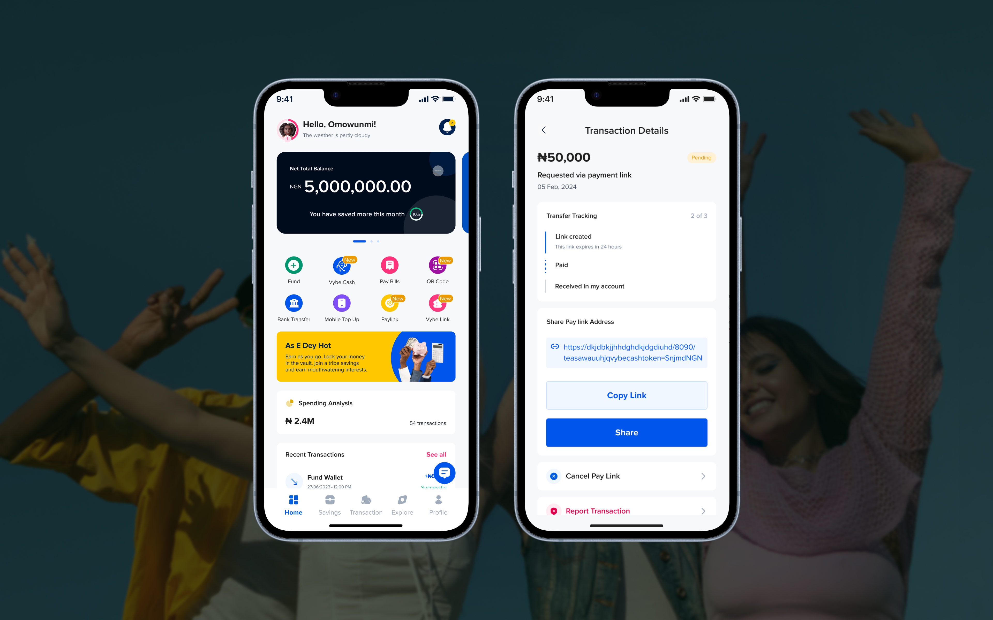
Core quick actions remain close at hand, but the redesigned experience also introduces Vybe Cash, Pay Link, Vybe Link and QR Code as additional transaction routes. Spending analysis and filterable recent transactions give users more context around where money is going, while financial articles and the bottom navigation provide routes into savings, transactions, Explore and account settings.
The important shift was that the home screen no longer acted only as a launchpad for transactions. It also became a place to understand balances, activity and the wider financial tools available inside the product.
The redesigned home brings action and awareness together: users can still move money quickly, but they can also understand balances, wallets, recent activity and spending without leaving the first screen.
Different payment situations need different shortcuts.
I designed several transaction routes around different payment situations rather than forcing every payment through the same conventional transfer flow.
Vybe Cash
A peer-to-peer transfer option for Vybecash account holders.
Pay Link
A request-for-payment link that can be shared with Vybecash users or external customers. A business, for example, can generate a link with the relevant payment information and send it directly to a customer.
Vybe Link
A shareable money-sending link designed for moments such as gifts and contributions, redeemable by people inside or outside Vybecash.
QR Code
A scannable way to receive payments using wallet and payment details generated by a Vybecash user.
Help people see where money goes—and plan where it should go.
I organised the money-management experience around two related behaviours: understanding current spending and setting money aside for what comes next.
Stash
A budgeting feature that lets users set aside funds within a wallet for a chosen purpose. The source describes it as flexible, without fees or interest, and available to break when needed.
Spending analysis
Transaction categories help users review where their money is going. Beyond giving users visibility, this also creates a clearer picture of spending behaviour inside the product.
Vault savings
A longer-term savings product with customisable plans and compound-interest terms described in the source. Wishlist and Tribe are also named among the product's savings options, although the supplied presentation does not detail their individual flows.
The aim was to give different money habits their own place in the product instead of treating budgeting, spending visibility and saving as one generic feature.
Money management is not one behaviour. Some users need visibility, some need structure and some need a longer-term reason to leave money untouched.
The ecosystem also extends to businesses.
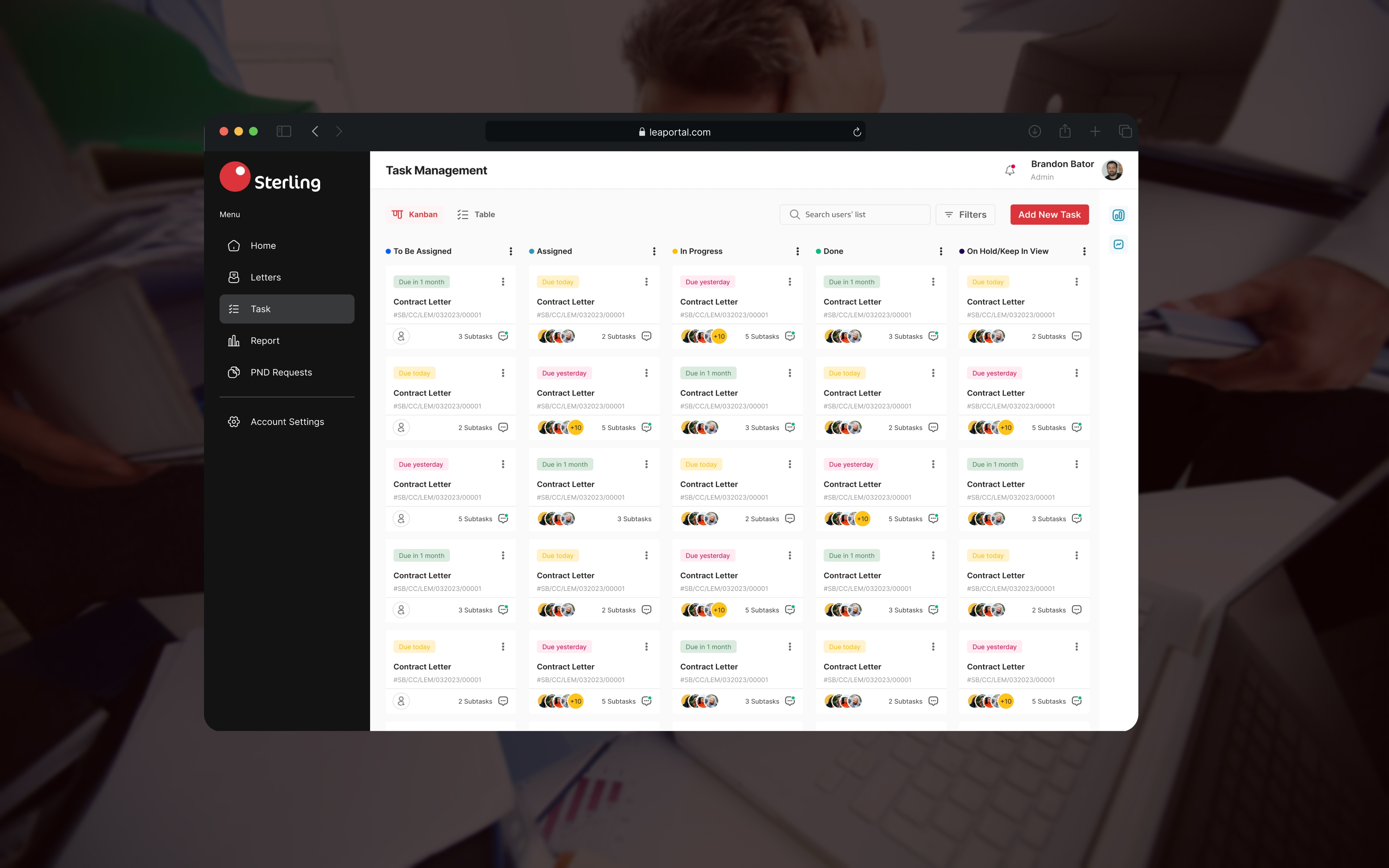
The original case study includes a business web-app presentation alongside the mobile product. Koko Enterprise's persona helps explain the need: a business operating across several outlets may need to review daily transactions, budget for operations and keep alternative payment options available when one account or service is unavailable.
That makes the business use case closely connected to the wider Vybecash proposition around multiple accounts, transaction visibility and flexible ways to collect money.
The supplied project material labels the business web app but does not provide a detailed written walkthrough of its interface, so this section should be supported by the original business screens rather than extending the feature story beyond what the source documents.
What changed after the rebuild.
The January 2024 relaunch provided a clearer view of how the rebuilt product was performing in use. During this period, Vybecash reached 2,258 beta users, processed 25,944 transactions and recorded more than ₦69M+ in transaction volume.
Those results came after a deliberate pause and wider rebuild of the customer experience, back office and supporting product systems rather than a surface-level visual refresh.
These are historical results from that beta period, not current Vybecash performance. Access was still controlled while remaining technical issues were being resolved before broader availability.
The relaunch was evidence that the redesign was part of a wider product recovery: the experience returned to users with measurable activity while the supporting systems continued to improve.
A financial product is more than a transaction screen.
Working with stakeholders exposed me more deeply to the financial models and regulations that shape a banking product. It also reinforced how much the customer interface depends on the operational systems behind it.
Prototype testing surfaced interest in investment options beyond the product's initial digital-banking and savings focus, including stocks and real estate. These were requests reported by users, not features confirmed as shipped.
The project reinforced the value of listening after launch. A product can look complete before release and still reveal different problems once people begin using it, which makes feedback, iteration and operational readiness part of the design work rather than something that happens after it.
What the design changed.
The redesign helped Vybecash return from its 2023 pause with a clearer customer experience, broader financial visibility and measurable activity during the January 2024 beta relaunch.
Beta relaunch
The beta relaunch reached 2,258 users while access was still being controlled and remaining technical gaps were being resolved.
Transaction activity
Users processed 25,944 transactions during the beta period, showing that the relaunch was being used for more than account exploration.
Transaction volume
More than ₦69 million in transaction volume was recorded during the relaunch period, showing that the rebuilt payment experience was supporting real financial activity.
Product recovery
The first launch led to a wider rebuild of the customer experience, back office and supporting technical systems rather than a surface-level visual refresh.
Financial visibility
Multiple wallets, quick actions, spending analysis, savings and finance content were brought together so users could act and understand their money from one clearer starting point.